By continuing to use the site, you agree to our use of cookies and to abide by our Terms and Conditions. We in turn value your personal details in accordance with our Privacy Policy.
Please log in or register. Registered visitors get fewer ads.
New Crest- Number 2 on 14:49 - Jan 28 by Hunterhoop
What they mean is
"will be given to a lettering expert to hide/remove, as much as possible, that penis shape formed by the end of the 'Q', the circle and the end of the 'R'.
I already think they have tweaked this. The original '2' saw the end of the 'Q' and end of 'R' link to form a very good penis shape, with the tip defined by the circle. I'm sure the club got feedback on this.
That's what they want to avoid across all medium.
Penis shape? Either you have a vivid imagination or a weird shaped penis...
Much better than the present Flavio bollx one, haven't bought 1 piece of merch since it was introduced, just couldn't bring myself to do so. So it will be interesting to see if there is any increase in sales once the new one is out.
2
New Crest- Number 2 on 20:42 - Jan 28 with 3408 views
New Crest- Number 2 on 18:43 - Jan 28 by Brightonhoop
Much better than the present Flavio bollx one, haven't bought 1 piece of merch since it was introduced, just couldn't bring myself to do so. So it will be interesting to see if there is any increase in sales once the new one is out.
One more customer here at least. I even considered buying a Oxford City shirt instead.
3
New Crest- Number 2 on 21:13 - Jan 28 with 3370 views
Great decision... Please reinstate the apostrophe. If/when I buy any merch with the logo on, I will add it myself!
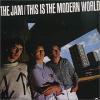
"You know, if one person, just one person does it they may think he's really sick and they won't let him in. And if two people, two people do it, in harmony, they may think they're both grammarholics and they won't take either of them. And three people do it, three, can you imagine, three people walking in to Loftus Road with apostrophe's on their badges and walking out. They may think it's an organization. And can you, can you imagine fifty people a day, I said fifty people a day walking in to Loftus Road with badges with apostrophes on them and walking out. And friends they may thinks it's a movement. And that's what it is, the Rangers Apostrophe Anti-Massacre Movement, and all you got to do to join is sing it the next time it come's around on the guitar!"
Appropriately, here's the ***1967*** recording...
0
New Crest- Number 2 on 21:40 - Jan 28 with 3354 views
New Crest- Number 2 on 18:43 - Jan 28 by Brightonhoop
Much better than the present Flavio bollx one, haven't bought 1 piece of merch since it was introduced, just couldn't bring myself to do so. So it will be interesting to see if there is any increase in sales once the new one is out.
Same as that mate.. There's a fair few R's fans who wouldn't buy anything R's with flavios badge on it...dig the new badge .!
1
New Crest- Number 2 on 22:08 - Jan 28 with 3319 views
I find it funny that we are sticking with the 1882 date, when I understand that the club named Queen`s Park Rangers was formed in 1886. Incidentally, I just checked to see if that was true on Wikipedia, and it`s also intriguing to find they are claiming both dates in different parts of the article. Quibbles aside, I definitely far prefer this badge to the tacky current one. I`ve long felt it`s a shame we don`t have a more interesting symbol, an animal or whatever, but it`s a bit late in the day to be inventing traditions. Well done to Fernandes and whoever else was involved.
[Post edited 28 Jan 2016 22:17]
0
New Crest- Number 2 on 22:10 - Jan 28 with 3315 views
I find it funny that we are sticking with the 1882 date, when I understand that the club named Queen`s Park Rangers was formed in 1886. Incidentally, I just checked to see if that was true on Wikipedia, and it`s also intriguing to find they are claiming both dates in different parts of the article. Quibbles aside, I definitely far prefer this badge to the tacky current one. I`ve long felt it`s a shame we don`t have a more interesting symbol, an animal or whatever, but it`s a bit late in the day to be inventing traditions. Well done to Fernandes and whoever else was involved.
[Post edited 28 Jan 2016 22:17]
"I find it funny that we are sticking with the 1882 date, when I understand that the club named Queen`s Park Rangers was formed in 1886."
According to club historian, Gordon Macey, QPR were formed in '86. No question. This is always what I had heard as well. Christchurch Rangers were formed in '82, he says. No formation date is given for St. Jude's. As far as I know, that date is unknown to all.
I'm not sure if it's a myth or not but I had always heard that aligning QPR with 1882 was a neat marketing trick by Gregory and his administration in the lead-up to the '81-'82 season and/or the '82 Final?
Anyone know if this is actually true?
"The opposite of love, after all, is not hate, but indifference."
I find it funny that we are sticking with the 1882 date, when I understand that the club named Queen`s Park Rangers was formed in 1886. Incidentally, I just checked to see if that was true on Wikipedia, and it`s also intriguing to find they are claiming both dates in different parts of the article. Quibbles aside, I definitely far prefer this badge to the tacky current one. I`ve long felt it`s a shame we don`t have a more interesting symbol, an animal or whatever, but it`s a bit late in the day to be inventing traditions. Well done to Fernandes and whoever else was involved.
[Post edited 28 Jan 2016 22:17]
The dreaded DP.
[Post edited 28 Jan 2016 23:22]
"The opposite of love, after all, is not hate, but indifference."
Haha....someone else pointed it out to be and I think they're bang on the money. Once you "see" it, it's very obvious. I hadn't noticed it all until it was pointed out. Even voted for it.
0
New Crest- Number 2 on 01:18 - Jan 29 with 3179 views
New Crest- Number 2 on 01:18 - Jan 29 by DeepcutHoop
Yep, was perfectly happy with the current one.
Didn't vote for any of the options given, they were all too similar and not something I like.
I shall immediately boycott the new badge and demand it be changed to something I like.*
*I won't of course, can you imagine being that childish.........
I'm definately that childish, and I'd suggest you were in a minority of people who didn't find that badge horrendous enough to campaign to have it changed. Democratically I might add.
For me it stood for the birth of corporate QPR, and the death of family QPR.
1
New Crest- Number 2 on 07:30 - Jan 29 with 3086 views
I'm definately that childish, and I'd suggest you were in a minority of people who didn't find that badge horrendous enough to campaign to have it changed. Democratically I might add.
For me it stood for the birth of corporate QPR, and the death of family QPR.
The worst excess was the 'chest hair'. The stylish old badge with the predominance of blue and white seemed perfect for either embroidery or an enameled lapel badge but the ridiculous ostentation of those silver flourishes said 'fake bling' that would usually end up being reproduced as thin metal foil over formed plastic.
I'm definately that childish, and I'd suggest you were in a minority of people who didn't find that badge horrendous enough to campaign to have it changed. Democratically I might add.
For me it stood for the birth of corporate QPR, and the death of family QPR.
Throwing hissy fits about a badge is not the mark of a grown-up tbf.
I'd love to see the proof that I'm in a minority that didn't like it too. Being able to choose from 4 similar badges to replace the current one, isn't democratic, just allowed me to choose which I didn't want least.
It's the QPR badge, that's what it represents, just as the new one will be. It was a big change from the previous one, but was well thought out and respectful to the history of the club, if a bit shiny.
I cannot imagine being so petty as to hate something that much when it stands for the club I love.
Unless it's Mark Hateley, obviously. But then I was a lot more childish back then.
0
New Crest- Number 2 on 11:55 - Jan 29 with 2545 views
New Crest- Number 2 on 11:51 - Jan 29 by DeepcutHoop
Throwing hissy fits about a badge is not the mark of a grown-up tbf.
I'd love to see the proof that I'm in a minority that didn't like it too. Being able to choose from 4 similar badges to replace the current one, isn't democratic, just allowed me to choose which I didn't want least.
It's the QPR badge, that's what it represents, just as the new one will be. It was a big change from the previous one, but was well thought out and respectful to the history of the club, if a bit shiny.
I cannot imagine being so petty as to hate something that much when it stands for the club I love.
Unless it's Mark Hateley, obviously. But then I was a lot more childish back then.
The democracy came a few months earlier when they carried out an extensive survey of what fans would like the crest that represents our Club (or the whims of an Italian fúckwit megalomaniac) to look like
QPR - "shit but local"
0
New Crest- Number 2 on 12:02 - Jan 29 with 2531 views
I find it funny that we are sticking with the 1882 date, when I understand that the club named Queen`s Park Rangers was formed in 1886. Incidentally, I just checked to see if that was true on Wikipedia, and it`s also intriguing to find they are claiming both dates in different parts of the article. Quibbles aside, I definitely far prefer this badge to the tacky current one. I`ve long felt it`s a shame we don`t have a more interesting symbol, an animal or whatever, but it`s a bit late in the day to be inventing traditions. Well done to Fernandes and whoever else was involved.